Work Experiences About LinkedIn ↗
Energy App UX Design Lean UX AI · IoT 2024–25

EcoBuddy —
Smart Electricity
Companion

An AI-powered energy management app designed to give UK households real-time visibility into their electricity consumption — and the tools to act on it.

0% Success Rate
0 Hypotheses
0 Competitor Apps
Solo End-to-End
— 01 · THE PROBLEM

UK households face an energy crisis they cannot see

The April 2025 energy price cap rose by 6.4%, pushing average household costs to £1,849 annually — the third consecutive rise since September 2024. Electricity demand is projected to grow by 50% by 2035 as the country electrifies transport and heating.

Yet 36.4% of UK households now spend more than 10% of their income on energy. Apps from British Gas, OVO, and Scottish Power are locked to provider accounts, show only next-day data, and provide no personalised guidance. I experienced this myself. That frustration became EcoBuddy.

£0

Average annual household energy cost — up 6.4% April 2025

0%

Projected electricity demand increase by 2035

0%

Households spending over 10% of income on energy

"Over half of UK homes have an EPC rating of D or below — the majority of users live in inefficient homes with limited upgrade options."

— UK Parliament Research Briefing, 2024

— The Solution

Six features. Each validated by a testable hypothesis.

EcoBuddy is a real-time energy management app that integrates with smart meters and IoT devices to deliver personalised AI recommendations, environmental impact metrics, and educational content — independent of any energy provider, in one place.

Real-time smart meter insights AI-powered personalised recommendations Environmental impact & EcoEducator Government scheme guidance Budget management tools Conversational AI support
— 02 · ROLE & PROCESS

Solo designer, end-to-end.

I led every stage — from scoping the research to shipping a tested, high-fidelity prototype. Lean UX was the right methodology for an MVP product: it keeps scope honest by validating assumptions before building, not after. Every design decision traces back to a tested assumption. Nothing was built without a reason.

Phase 01
Think
Research · Surveys · Interviews · Affinity · Assumptions · Personas
24 assumptions stress-tested — only the highest-impact ones became hypotheses.
Phase 02
Make
Hypotheses · Information architecture · Lo-Fi · Hi-Fi · Style guide
Seven hypotheses. Every screen, every feature traces back to one.
Phase 03
Check
Usability testing · Task-based scoring · 91% success
Tested to find friction, not confirm assumptions, two failures flagged what to fix next.
— 03 · RESEARCH

Understanding the space before drawing a single frame

0%

Of household energy use is space heating — yet most apps treat all consumption identically

0%

Of UK consumers say smart home technology costs too much — EcoBuddy had to work with what users already owned

Competitor Analysis

I analysed five existing energy apps — British Gas, OVO Energy, Ivie, Energy Saver App, and Scottish Power. The gaps were consistent across all five.

Gap EcoBuddy's Response
Delayed data — next-day only Real-time smart meter integration
Provider lock-in Works independently of any supplier
No personalisation AI recommendations based on individual usage patterns
No environmental metrics CO₂ impact made tangible for users
Overwhelming notifications Customisable, targeted alerts only
No government scheme guidance Dedicated ECO4 and scheme content section

Primary Research

0%

Prefer mobile as their primary platform

0%

Manage consumption via smart meter

0%

Cited real-time insights as most desired feature

0%

Spend £100–£200 monthly on energy bills

Semi-structured interviews with 4 participants gave depth — a homeowner in a three-storey townhouse, a London flat renter, an apartment owner, and a new property buyer. Seven themes emerged from the raw data: demographics, pain points, behavioural factors, awareness, preferences, suggestions, and dislikes.

Finding 01

Difficult to get real-time insights — existing apps only show next-day data

Finding 02

Lack of personalisation — generic tips don't account for house type or usage behaviour

Finding 03

Lack of knowledge — users want education alongside data, not just numbers

Finding 04

Fragmented solutions — managing energy across multiple apps creates friction

Affinity Mapping

Interview data was synthesised into an affinity map across four participants, producing business and user assumptions before any design decisions were made.

Affinity diagram map — 7 themes surfaced from interview transcripts

Affinity map across 4 participants — 7 themes surfaced, including Pain Points, Behavioural Factors, and Preferences. Four key findings shaped the entire feature set.

Personas

Every feature decision was filtered through two distinct users.

RS
Rajat Sen, 55

IT professional · 3-floor London townhouse · Frustrated by delayed data and basic provider insights. Wants real-time visibility to act on his energy use.

Directly shaped H1 — the real-time dashboard built independent of any supplier.

JR
Jessica Ross, 30

Sales manager · New 2-bed apartment · Lacks consistent energy habits and knowledge. Wants simplicity and fewer notifications.

Directly shaped H2 and H3 — personalised recommendations and the EcoEducator.

Both personas were stress-tested against every feature decision — if a feature didn't solve a pain point for either user, it didn't make the MVP.

User Journey Map

The full user experience was mapped across six stages to identify emotional low points and the design decisions they drove.

User journey map

User journey map — 6 stages from Awareness to Advocacy. Emotional low points at Onboarding (trust gap) and Exploration (information overload) directly shaped the simplified dashboard and step-by-step device connection flow.

— 04 · HYPOTHESIS-DRIVEN DESIGN

No feature built without a testable reason

Rather than jumping to wireframes, I converted prioritised assumptions into 7 testable hypotheses using the Lean UX format — "We believe [business outcome] will be achieved if [user] attains [benefit] with [feature]." Every screen had a direct line back to a testable assumption. Design was not decorative — it was evidence-building.

Scope discipline is as important as feature design. These items were deliberately cut from the MVP to keep the core testable and coherent.

Deliberately Cut from MVP
Gamification Community features Water management Extra hardware Provider collaboration
# Business Outcome Feature Result
H1 Increase user engagement and retention Real-time dashboard + spike alerts 80%
H2 Improve customer satisfaction through personalisation AI recommendations + notification preferences 100%
H3 Enhance brand loyalty via environmental empowerment Impact metrics + EcoEducator content 100%
H4 Increase engagement through budget management Budget tool + goal-setting 60%
H5 Increase app value via government scheme information ECO4 + funding scheme content 100%
H6 Drive broader adoption through simplified navigation Intuitive interface design 100%
H7 Improve satisfaction through instant AI support Conversational chatbot — LLM + RAG 100%
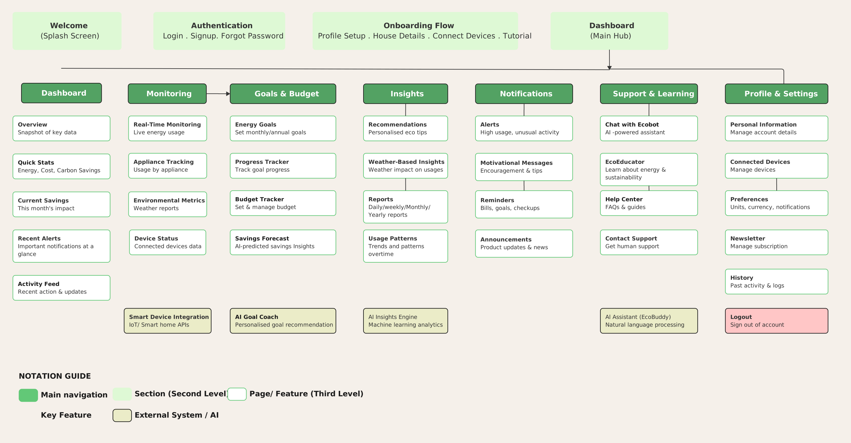
— 05 · INFORMATION ARCHITECTURE

Structure before screens

The IA was built directly from the seven hypotheses — every section of the app maps to a validated user need identified in research.

EcoBuddy information architecture showing all app sections mapped to hypotheses

IA mapped directly to hypotheses. Home dashboard (H1) · Analytics (H1) · EcoEducator (H3 & H5) · Budget (H4) · EcoBuddy Chat (H7) — every nav item traces back to a validated assumption.

— 06 · Lo-Fi & Design System

From rough sketches to structured flows

Before opening Figma, every screen was sketched by hand. Low-fidelity wireframes mapped six core screens — Home, Device Analytics, Smart Meter Analytics, Scan and Connect, Eco Educator, and EcoBot — directly from the information architecture and the seven hypotheses. The sketches confirmed which features belonged at each navigation level and which hypothesis each screen was serving before any visual design decisions were made.

✏️ Lo-Fi Wireframes Replace with your hand-drawn sketch photo · All 6 screens · Scan or photograph at high resolution

Six screens sketched before Figma was opened. Home · Device Analytics · Smart Meter Analytics · Scan & Connect · Eco Educator · EcoBot — each mapped directly to a prioritised hypothesis.

A design system built for consistency and accessibility

A style guide was established before any hi-fi work began. Colour contrast ratios, text sizes, and button tap targets were verified against WCAG AA standards. Typography — DM Sans throughout — was chosen for legibility across all ages including the 55+ persona identified in research. Following H4 usability feedback, button sizing and component scale were revised before the final prototype was completed.

Colour Palette

A single-hue green system — every shade chosen to reinforce the environmental and sustainability positioning without visual noise.

Primary #0D2118
Forest #1A6E38
Mid Green #2E9150
Light Green #45B569
Body Text #3A5E42
Muted #82A688
Background #EBF5ED
Typography Scale

DM Sans across all levels — simple yet modern, chosen for legibility across all ages from 28 to 55+.

Heading Hello, Jennie
Subheading Daily Limit
Body Track your energy usage in real time
Nav Label HOME
Logo
Core Components

Rounded pills and soft cards — deliberately approachable for users who feel anxious or overwhelmed by energy bills.

Primary Button
Live Badge LIVE
Chip / Filter Living Room TV
Card
💡 EcoBuddy Recommends
It's peak hours — delay high-power devices.

Design system established before hi-fi began. Colour contrast, touch targets, and type scale verified against WCAG AA — updated after H4 usability feedback before the final prototype.

— 07 · SELECTED DESIGN DECISIONS

Every choice has a reason

These decisions are directly traceable to research findings and hypothesis requirements — not aesthetic preferences.

Dashboard · H1

Leading with real-time kWh, not estimates

Research showed users were frustrated by delayed, next-day data. The dashboard prioritises live consumption from the smart meter so users can act immediately — not retrospectively.

AI Insights · H2

Personalised tips, not generic advice

A key interview finding: users actively disliked generic tips. EcoBuddy's recommendations are tailored to the user's actual consumption patterns and home details.

EcoEducator · H3

Making environmental impact tangible

Research found that connecting savings to tangible impacts — "saving plastic bottles" or "planting trees" — was motivating. The EcoEducator translates actions into visible outcomes.

Notifications · H2

Customisable alerts, not notification fatigue

Users flagged frustration with excessive notifications from existing apps. Weekly summaries were preferred by 57.1% of survey respondents.

Government Schemes · H5

Scheme guidance built in, not bolted on

Users had no visibility of ECO4 and government grants. EcoEducator's dedicated scheme section surfaces eligibility information directly — no external redirects.

Navigation · H6

Five tabs, zero confusion

Navigation was tested explicitly — users found their target screen without assistance. A flat five-tab structure replaced any layered menu approach.

EcoBot · H7

Conversational AI, not a help page

Users wanted answers in context, not documentation. EcoBot uses LLM and RAG to answer energy questions conversationally — tested and validated at 100%.

Final Screens — Live Demo
Dashboard
Device Insights
Devices
Learn
EcoBot
— 08 · TESTING & RESULTS

Validated with real users. 91% success rate.

7 hypotheses tested · 5 fully validated · H1 and H4 partially passed — both pointed clearly to the next iteration

0%

Overall usability success rate across 7 hypotheses

0/7

Hypotheses tested in a 5-task formative usability test

H4 · 60%

The most instructive partial pass — informed the next iteration

What H1 at 80% told me

Four of five participants passed. One participant failed the task. The result confirmed that real-time dashboards are a meaningful differentiator — and that the remaining gap is worth addressing in the next iteration.

What H4 at 60% really meant

Two of five participants failed the budget tracking task. Post-test feedback pointed clearly to the visual design — specifically the sizing of certain interface components like buttons — as the barrier. The feature concept is right. The execution needs refinement. The next iteration focuses on component sizing and visual hierarchy within the budget tool.

— 09 · REFLECTION

What I learned, what I'd change, what comes next.

What Worked
Hypothesis-driven structure kept every decision traceable — when H4 failed, the framing made it immediately clear what to revisit
Competitor analysis identified a genuine gap early, giving EcoBuddy a clear position
Device-based analysis was a standout in testing — participants called it out unprompted
The Lean UX cycle kept the project moving without over-investing in any artefact before validation
What I'd Do Differently
Test the budget feature earlier — at lo-fi stage — so component sizing issues could be caught before full fidelity
Recruit a broader age range — all five participants were tech-familiar; the 55+ persona was not represented in testing
Run a second testing round after addressing H4 feedback to confirm the fix holds
What Comes Next
Energy provider integration — a unified platform with live billing and usage data would close the last gap between EcoBuddy and full energy independence.
EV charging integration — as the UK electrifies transport, home charging will become a primary energy cost. The architecture already supports it.
Onboarding redesign — usability feedback pointed to UI complexity at early stages. The next iteration would simplify the device connection flow and introduce progressive disclosure to reduce friction at sign-up.

"H1 and H4 partially failed — and that was equally valuable. They showed exactly where the next iteration needs to go. That cycle — discover, frame, design, test, learn — is the work."

"EcoBuddy was designed with evidence, not instinct."

Every screen traces back to a user insight. Every decision traces back to a hypothesis. That is the work.

Next Project
UX Design · Enterprise App
ParkHere

An enterprise parking management app that reduced driver wait times from 48 hours to 10 hours at Neelkamal Steels.

View Case Study →