Work Experiences About LinkedIn ↗
Industry Project UX Design Enterprise 2025

ParkHere —
48 hours to 10.

A real enterprise project. A steel manufacturing facility losing days to unorganised truck parking. A pre-booking app that cut driver wait time by 80% — designed and led by me as Employee Experience Designer at Neelkamal Steels.

80% Reduction in driver wait time
12 weeks Enterprise delivery
3 User flows designed
Lead Designer, 2-person team
— 01 · THE PROBLEM

Truck drivers were losing days, not hours.

This was not a hypothetical brief. At Neelkamal Steels, unorganised truck parking had become an operational crisis. No booking system meant drivers arrived with no idea where to go. No slot visibility meant they circled the factory for hours. Queues stretched to 48 hours. Congestion inside the facility caused loading delays, production bottlenecks, and rising operational costs.

The problem affected everyone — drivers losing days of productivity, factory operations backing up, and a supply chain stretched thin. The business needed a solution. The brief came to us: design something that works.

48h
Average driver wait time before ParkHere
10
Trucks waiting overnight every day with no confirmed slot
₹30,000
Lost per driver per delay due to missed subsequent loadings

"I don't want to think when I arrive. I just want to know: where do I go, and how long do I have? That's it."

— Rajesh, HMV Driver
— 02 · ROLE & PROCESS

Lead designer, end-to-end.

The constraint was designing for users I couldn't easily test with — drivers on tight schedules, inside a working factory.

Role
Employee Experience Designer · Lead UX · 2-person team
Client
Neelkamal Steels, India
Duration
12 weeks · 2025
Type
Enterprise · Industry project
Tools
Figma · FigJam · Miro
01 · Discover
Field research & context

Site visit, driver interviews, mapping the broken experience.

02 · Define
Problems & principles

Three pain points, primary persona, design constraints for in-motion use.

03 · Develop
Prototype & iterate.

Lo-fi to hi-fi. Zone-based booking. Landmark navigation.

04 · Deliver
Hi-fi & handoff

Stakeholder sign-off. Prototype handed off. Outcome: 48h → 10h.

When the design changed direction

The first booking screen asked drivers to pick a slot number. They don't know slot numbers — only zones. The entire screen was redesigned. That one piece of feedback saved a flow that would have failed on day one.

— 03 · DESIGN PRINCIPLES

The constraints that shaped every decision.

Three principles emerged from field research and guided every design choice — from screen layout to what features we deliberately left out.

Principle 01
Clarity over density

Drivers make decisions in seconds, often under stress, often in motion. Every screen must communicate one primary action.

Principle 02
Design for the context, not the ideal user

Our users are in a moving truck, under sun glare, with 12 hours of fatigue. Design for that person — not the best-case scenario.

Principle 03
Efficiency for both sides of the transaction

A parking app that works for drivers but creates chaos for operations managers is not a solution. Every feature had to earn its place by solving a problem on both sides: the driver arriving, and the facility receiving them.

— 04 · USERS & STAKEHOLDERS

Who we were designing for.

Three user types, one primary. Understanding the full ecosystem — and prioritising ruthlessly — was the first design decision of the project.

🚛
Primary User
HMV / Truck Drivers
Regular delivery drivers visiting the factory 3–5 times per week. High context, low patience for friction. Decisions made in seconds, often while driving.
🏭
Secondary User
Factory Operations Staff
Managing incoming vehicles, slot allocation, and loading schedules. Needed a system that reduced reactive manual coordination.
📊
Stakeholder
Facility Management
Business owners of the parking problem. Cared about cost reduction, throughput efficiency, and operational reporting over time.
🚛
Rajesh Patel
HMV Driver · 10+ years experience · 3–4 visits to Neelkamal Steels per week
Background
Long-haul truck driver based in Rajasthan. Has been servicing steel factories for over a decade. Arrives early, often waits. Knows the factory layout by memory — but not the slot numbering system, which changes monthly and nobody communicates.
Goals
Get in, park, load, get out. Minimise wait time. Know where to go before he arrives. Avoid confrontation with factory staff for being in the wrong spot. Get home before dinner.
Pain Points
No arrival information. Different staff give different directions. Slot numbers change with no notice. Waited 43 hours once for a confirmed slot. Cannot safely use most apps while driving. Nowhere to rest while queueing.

"When I call ahead, they tell me there's space. When I arrive, there isn't. Then I wait. For days. This is not how work should be."

— Rajesh Patel, during field interview

Before & After Journey Map

Six phases from a driver's perspective — what happened before ParkHere, and what changes with it.

Pre-Arrival Arrival Navigation Parking Active Session Exit
User Actions Calls factory; gets vague answer. Sets off anyway. Arrives at gate. No information. Joins queue. Asks multiple staff. Gets conflicting directions. Finds a spot informally. Risk of being moved. Sits in truck, no updates, no estimated time. Manually checks in at gate. Long process.
Experience Improvement Pre-books a slot from the road. Sees real-time availability. Arrives knowing exactly which zone. No queue. In-app navigation with landmark steps to zone. Confirmed, reserved slot. Scans QR to activate. Timer running. Can extend or end from phone. Ends session in-app. Automated exit log.
Emotional State Before 😤 Anxious → After 😌 In control Before 😰 Frustrated → After 😊 Informed Before 😡 Confused → After 🗺️ Guided Before 😟 Uncertain → After ✅ Confirmed Before 😴 Powerless → After ⏱️ Tracked Before 😩 Slow → After 🚀 Fast & digital
— 06 · KEY USER FLOWS

Three flows. No detours.

Every task a driver needs to complete maps to one of three flows. Each was designed to be completable in under 60 seconds.

Flow 01 — Onboarding & Setup
Getting started on day one
Welcome
Sign Up / Login
Vehicle Details
Home
Flow 02 — Parking Discovery & Booking
Finding and securing a slot
Home
Map View
View Zones
Select Slot
Confirmation
Flow 03 — Navigation & Active Parking
Getting to the slot and managing the session
Booking Confirmed
Navigation
Park at Slot
Active Session
End Session
— 07 · INFORMATION ARCHITECTURE

Flat, fast, findable.

The IA was designed around one insight: drivers need to reach their primary action (Find Parking) in one tap from anywhere. No buried menus, no nested flows, no cognitive load on arrival.

Parking App
Onboarding
Sign Up / Login
Vehicle Setup
Home
Live Status
Recent Parkings
Parking Map
Zone View
Slot Selection
Booking
Navigation
Active Parking
— 08 · LO-FIDELITY DESIGN

Sketching before committing.

Lo-fi wireframes were used to test layout logic and flow before investing in pixels. Five key screens across the core booking flow were sketched and tested with drivers in the field.
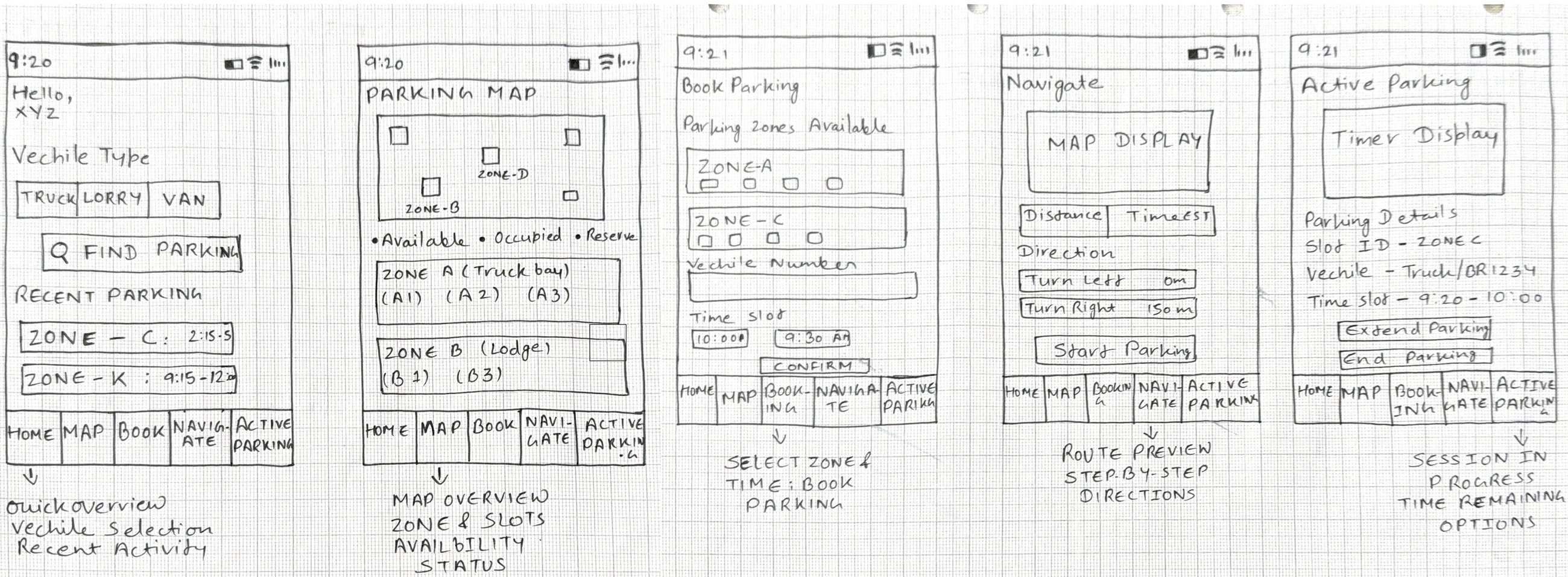
Lo-fidelity sketches: home, parking map, book parking, navigate, and active parking screens
— · Design System

A visual language built for readability in any light.

Colour
Six colours. Each one earns its place.
#FEC107
Yellow
#3A3E47
Dark
#4CAF50
Green
#F9D7D7
Pink
#FFFFFF
White
#FFF8E7
Warm
Yellow = CTAs, selected states, brand. Dark = timer, nav, icon backgrounds. Green = slot availability. Pink = end session only. White + Warm = backgrounds and inputs.
Typography
Manrope — legible at every size.
Bold Screen titles
Semibold Labels and buttons
Regular Body content
Light Secondary labels, timestamps
Chosen for high legibility at small sizes in varied lighting conditions.
Touch Targets
Designed for in-cab use with gloves on.
All interactive elements minimum 44 px.
Large tap areas on primary CTAs — designed for use inside a truck cab.
Vehicle selector chips, slot chips, and direction steps all finger-friendly.
Component Principles
Scannable without reading.
Corner radius 8 px cards, 6 px chips.
Filled icons on #3A3E47 backgrounds with yellow accent.
Colour-coded slot status: green / red / yellow — no reading required.
High contrast throughout for direct sunlight and low-light cab environments.
— 09 · HI-FIDELITY DESIGN

The five screens that matter.

Every hi-fidelity decision traces back to a field interview, a failed prototype, or a constraint the factory floor imposed. Warm, high-contrast, built for stress conditions.
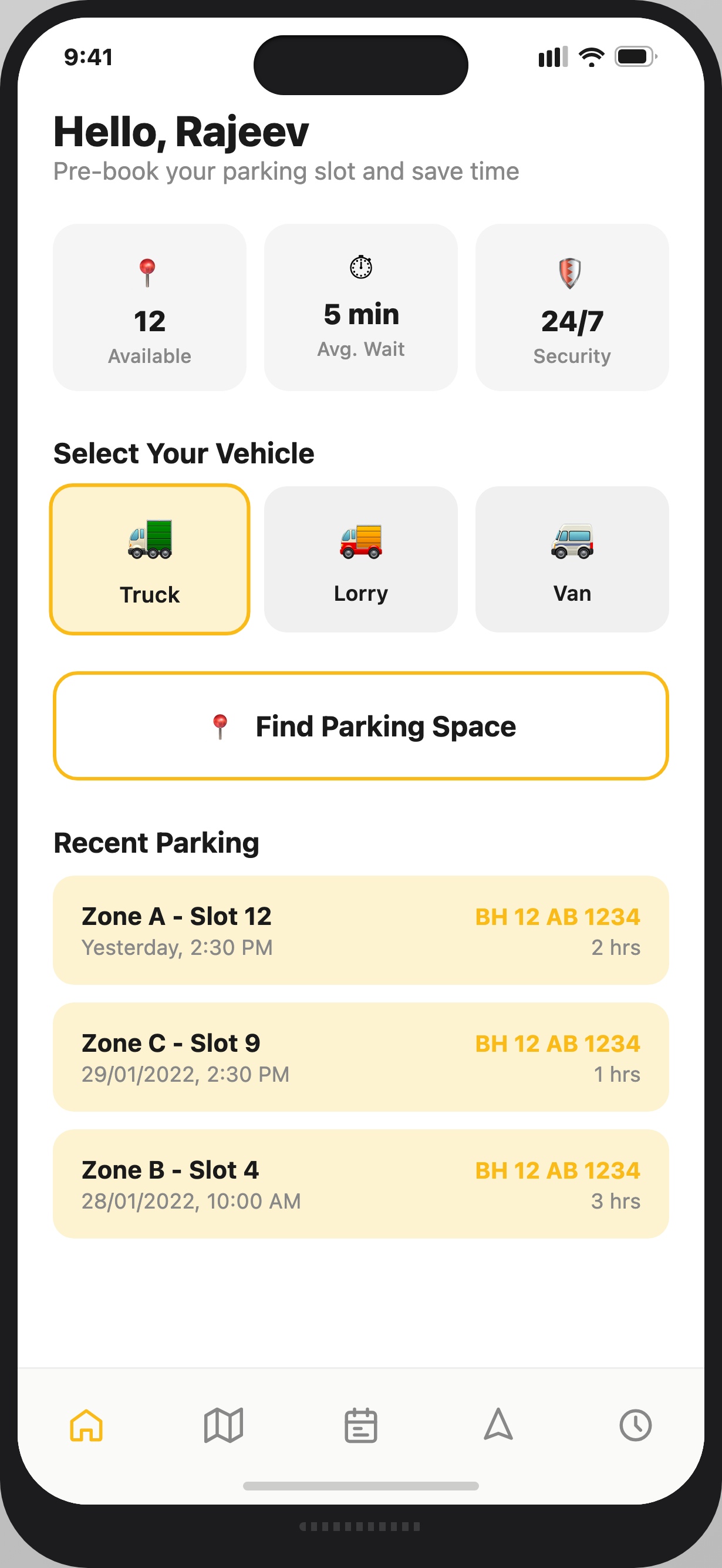
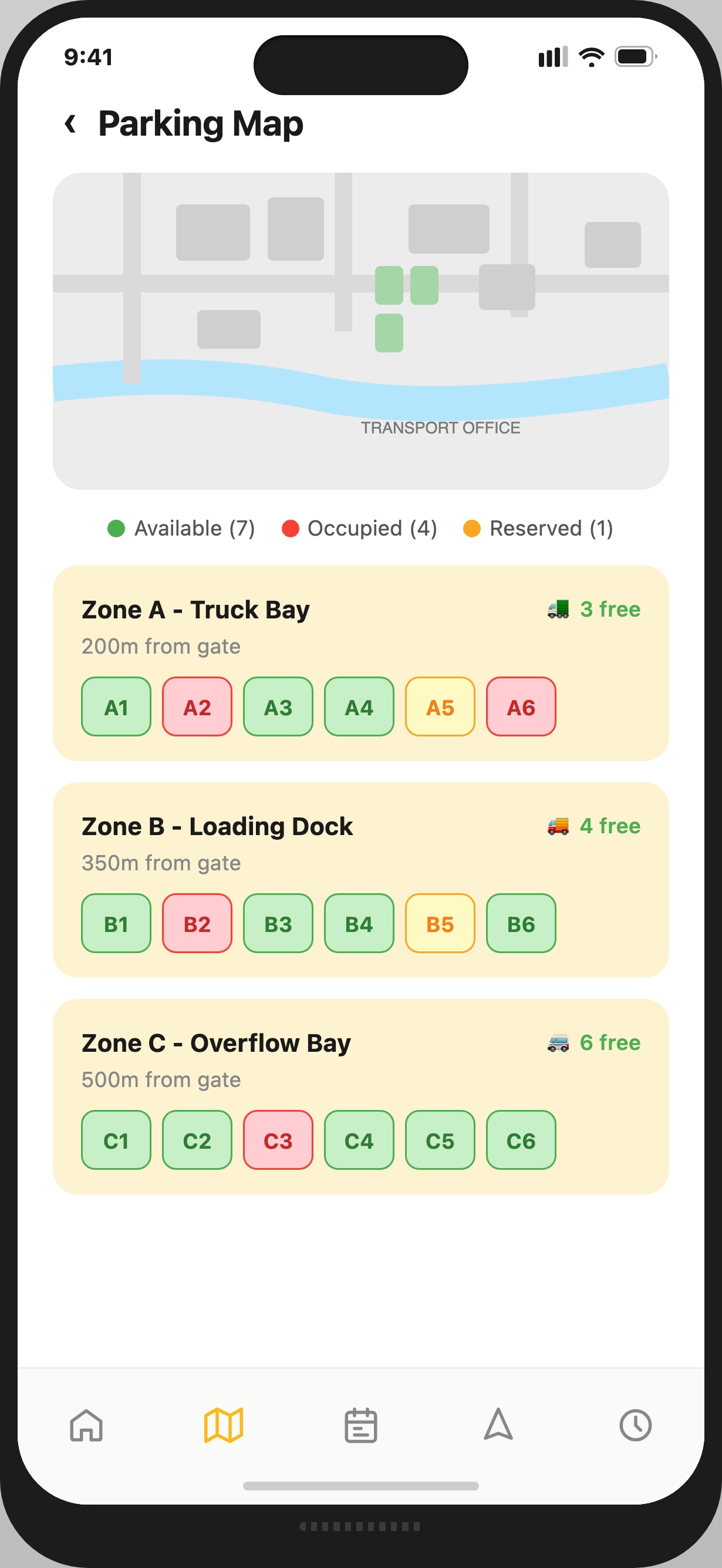
ParkHere Home Screen
Home / Dashboard
ParkHere Parking Map Screen
Parking Map
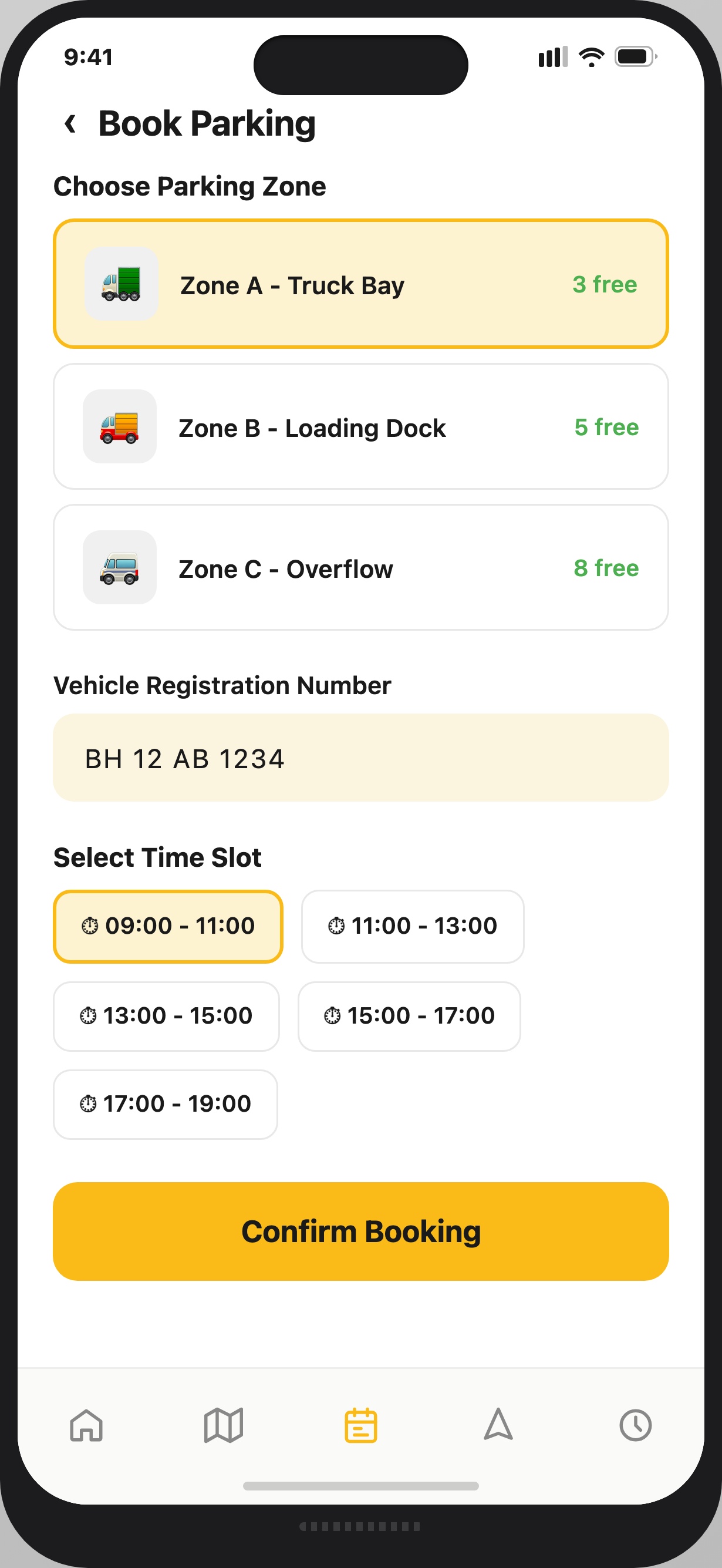
ParkHere Book Parking Screen
Book Parking
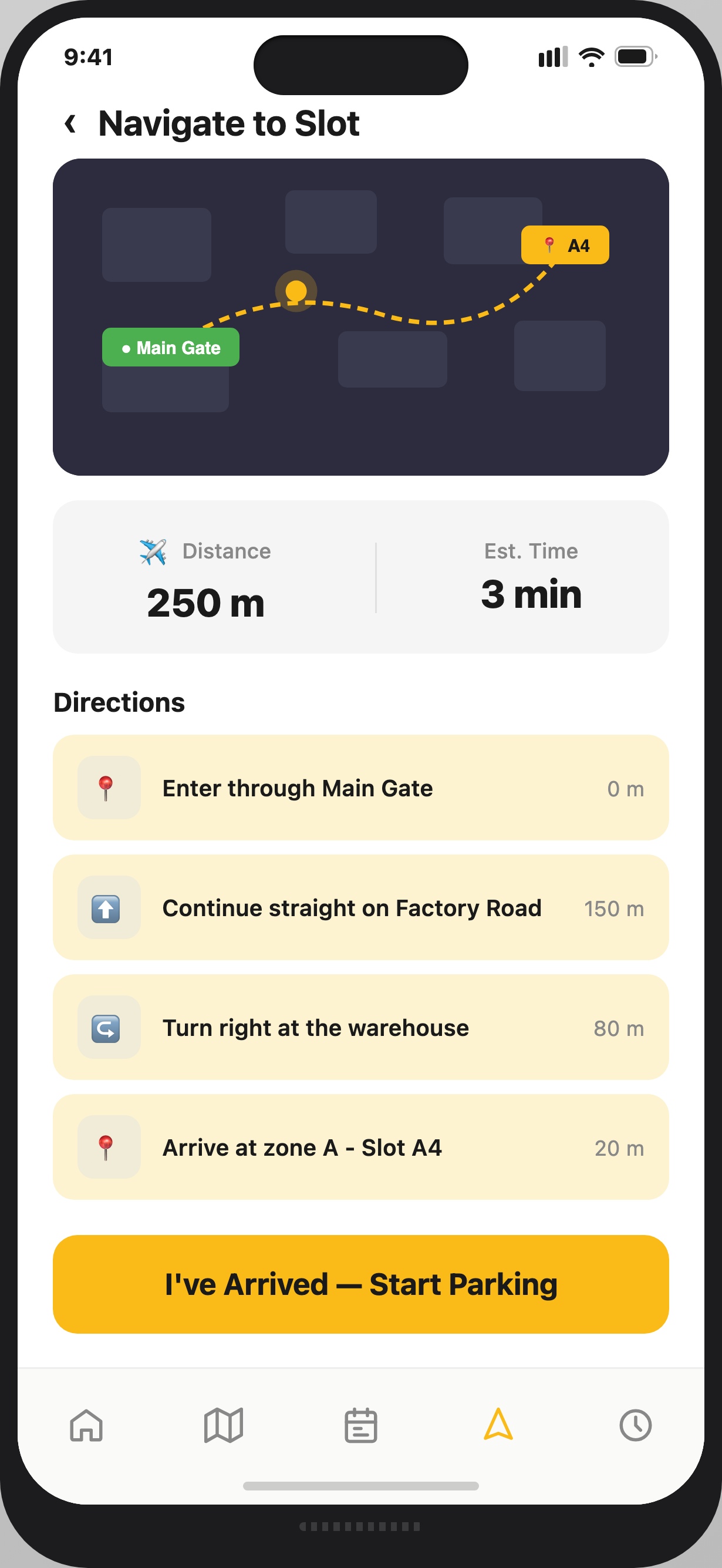
ParkHere Navigate Screen
Navigate to Slot
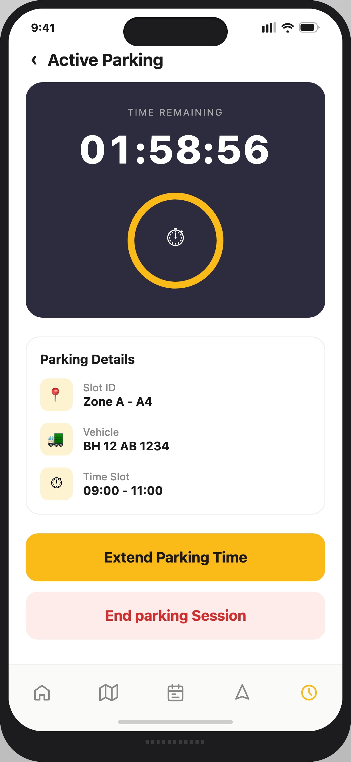
ParkHere Active Parking Screen
Active Parking
— 05 · KEY DESIGN DECISIONS

Every choice has a reason.

Design decisions weren't made on intuition. Each one came out of research, iteration, or — in one case — a screen that completely failed in testing.

Home Screen
Real-time status, not a list
Before
Original: List of parking locations
After
→ Live KPI chips + vehicle selector on load
Early designs used a list of options — testing revealed drivers need spatial orientation first. A map-first home screen means a driver knows availability before entering the premises.
Booking Flow
Zone-based, not slot-level
Before
Original: Pick a specific slot number
After
→ Select a zone; system assigns the slot
Drivers don't know slot numbers, they know zones. Zone-based booking removed an entire layer of decision-making at the most time-pressured moment.
Navigation
Landmarks, not GPS coordinates
Before
Original: Turn-by-turn GPS navigation
After
→ Landmark steps: "Past the weighbridge, left at the red shed"
GPS doesn't work reliably inside a factory. Directions written using physical landmarks — Main Gate, Factory Road, warehouse — can be followed without looking at the screen.
Active Parking
Two actions. Nothing else.
Before
Original: Full session management menu
After
→ Extend / End Session only
Once parked, a driver only needs to extend or end the session. The most consequential screen in the flow has the fewest elements.
What the stakeholder wanted
A full operator dashboard — real-time slot management, driver history, billing reports, and fleet analytics — all in the first release. The facility management team had a long wishlist they were eager to see delivered.
Why we said: not yet
The operator dashboard was deliberately scoped out of v1. Building it first would have delayed the driver-facing app by months and introduced complexity before validating the core flow. Solve the acute pain first: get drivers parked. The dashboard follows once the system is trusted.
— 10 · IMPACT & OUTCOMES

The numbers that justified the project.

These aren't projected outcomes — they're measured reductions against a documented baseline. The 48-hour wait was real. The 10-hour post-app average is real.

48h
Average wait before
80% reduction
10h
Average wait after
80%
Reduction in driver wait time
20%
Estimated operational cost reduction
Driver satisfaction & engagement
— 11 · REFLECTION

What I learned, what I'd change, what comes next.

What Worked
Field research changed everything
  • Landmark-based navigation — drivers could follow it without looking at the screen.
  • Zone-based booking reduced decision load compared to slot-level selection.
What I'd Do Differently
Test the assumption, not just the design
  • I assumed drivers knew slot numbers — they don't. Validate mental models before wireframing, not after.
  • Test with actual drivers on-site, not just stakeholder review.
What Comes Next
The operator dashboard
  • Operator dashboard — a web interface for operations managers with live slot occupancy.
  • A usability testing round with HMV drivers on-site — the one test that hasn't happened yet.

"This project taught me that designing for real operational constraints produces better UX than designing for ideal conditions. Every constraint became a decision."

80%
reduction in driver wait time — 48 hours to 10.
"ParkHere was designed for real constraints, not ideal conditions."

Every screen traces back to something a driver said, something an operations manager needed, or a constraint the factory floor imposed. That is the work.